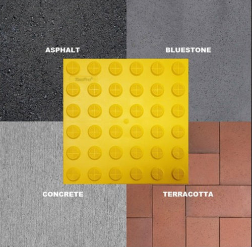
Tactile indicators must provide a high visual contrast to the walking surface.
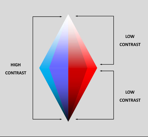
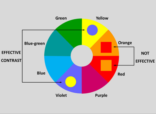
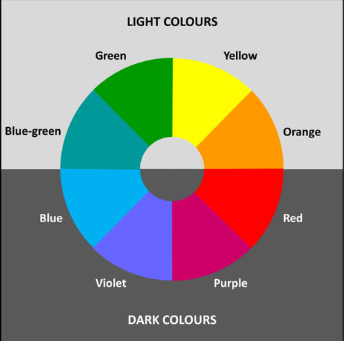
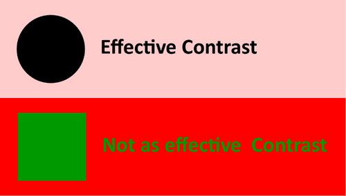
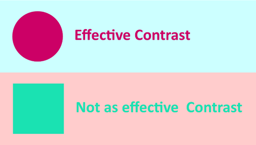
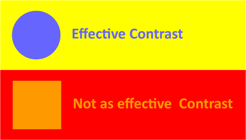
The colour or visual contrast between the walking surface and surrounding environment is technically know as the Luminance Contrast and is critical for people who have low vision. They are using their limited residual vision for orientation, distinguishing the limits of the footpath, recognising hazards and gathering information. Contrast is especially important in the provision of Tactile Indicators to warn pedestrians of hazards.
AS/NZS 1428.4 requires the following luminance contrast to the immediately adjoining surface:
-
 30%
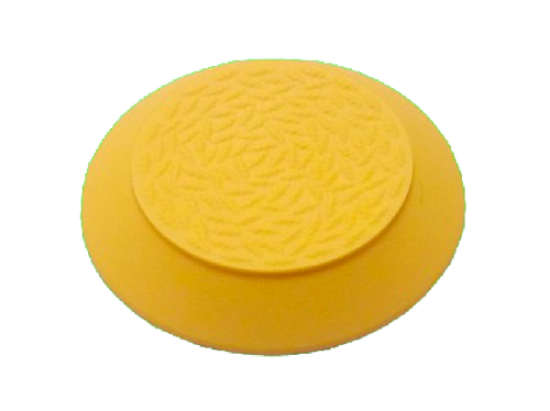
30%Tactile Pavers or Tiles of uniform colour (Integrated Tactile Indicators)
-
 45%
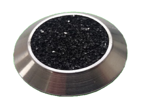
45%individual Tactiles of uniform colour (Discreet Tactile Indicators)
-
 60%
60%Tactiles with a different colour on the side than the top surface (Composite Tactile Indicators)